How Sports Teams Leverage Tableau to Increase Profits Behind the Scenes

The sports industry has seen a meteoric rise in the use of data analytics to select the best talents, thanks to initiatives like Billy Beane’s ‘Moneyball’ strategy. The Oakland Athletics might not have clinched the World Series title during Beane’s tenure, but they consistently defied financial constraints, making it a true example of successful data-driven decision-making. It is not, however, just about player selection. Teams are also capitalizing on data to maximize revenue streams. A tool at the forefront of this revolution is Tableau. In this deep dive, we examine how sports organizations, particularly the Texas Rangers, use Tableau to streamline operations, engage fans and boost revenues. And they must be doing something right, as the 2023 World Champions! Table of Contents How Professional Sports Franchises Make Money Spotlight: The Texas Rangers’ Success with Tableau Strategies: Leveraging Tableau to Drive Sales for Sports Teams Conclusion: The Tableau Advantage in Sports How Professional Sports Franchises Make Money The NFL is by far America’s most successful sports league. With 32 member franchises that are individually owned (excluding the publicly-owned Green Bay Packers), its financial transactions are mostly private and intricate. Even so, Bloomberg estimated its earnings at a staggering $15 billion in 2018, up from $13.3 billion in 2016. Revenues are classified into ‘National’ and ‘Local’. In 2018 alone, the NFL amassed $8.1 billion in national revenue, translating to $255 million for each franchise. Meanwhile, local revenues vary; the Packers generated $196 million, accounting for 43% of their total earnings. Of note, Green Bay had an operating income of only $38.5 million, because they spent $420 million on stadium upkeep, wages, marketing, and team and administrative costs. In contrast, the Dallas Cowboys who are the richest team in the NFL, had an operating income of $365 million. That is a whopping 10x difference. Breaking down various revenue-generating vehicles further: TV Deals: Approximately 50% of a team’s revenue Merchandising & Licensing: Close to 10% of revenue Ticket Sales & Concessions: Roughly 7% of revenue Corporate Sponsors: Varies widely across teams Gambling: A potentially large revenue stream since the Supreme Court’s 2018 ruling For franchises eager to maximize every dollar, leveraging Tableau, especially in merchandising, ticket sales, and concessions, can be a game-changer. Enter the Texas Rangers. Spotlight: The Texas Rangers’ Success with Tableau Arlington is the home of the Texas Rangers’ Globe Life Park. It is among the world’s largest baseball stadiums with a capacity of 49,115. Making sure the place is full for every home game is a challenge unique to Major League Baseball (MLB). In the NFL, there are just eight home games in a regular season and the NBA has 41 regular-season home games. The Rangers have to try to sell out 81 home games each season! To address this, the Rangers deployed Tableau to monitor real-time ticket sales, merchandise transactions, and food & beverage trends. The results have been enlightening, as demonstrated in the table below, showcasing the declining attendance pattern from 2012-2019. The Rangers had peak attendance in the 2012 season with 3.46 million, and a low attendance in 2018 with 2.1 million. 2019 was only slightly higher at 2.13. Four Ways the Rangers Used Tableau to Boost Sales & Revenue Real-Time Ticket Sales Data: The Rangers’ staff used Tableau to bring several data sources together into a single view. The front-office team created a dedicated ‘Analytics Task Force.’ The team ensured that employees in different departments were able to access data and share dashboards. Ticket Specials: The Texas Rangers launched a special four days before a Father’s Day game and were able track the real-time performance. The franchise also used Tableau to discover that approximately half of the individual ticket sales occur in the 10 days before the game, including on the day of the event. Staffing: The staff of the Rangers used Tableau to understand how rain delays affected sales. The team discovered that there wasn’t a single ticket sale for 15 minutes after rain delayed a game. As a result, the Rangers decided to shut down three-quarters of its box-office windows. Promotions: The team believed that the highest sales for ‘bobblehead’ nights occurred on Friday, Saturday, or Sunday. They were shocked to learn that Tuesday was the best seller! The Rangers added an extra bobblehead night on a Tuesday night game at the end of a month. The result was an increase in ticket sales. Ideas for Sports Teams to Leverage Tableau to Drive Sales Tableau isn’t exclusive to the Rangers. Here are a few ways other sports teams can take advantage of the data and insights: Ticket Sale Visualization: Spotting trends becomes effortless with Tableau, allowing swift interventions to boost sales. Fan Experience Analytics: Besides victory, fans crave an immersive experience. Determine impactful metrics such as when fans typically leave or which promotions resonate most. Concession Stand Optimization: Evaluate food & beverage offerings, price points, and peak purchase times. Merchandise Metrics: Gauge past performance, identify top-selling items, and pinpoint the most lucrative price ranges. Conclusion: The Tableau Advantage in Sports Data collection is only half the battle; interpreting and utilizing that data is where the real magic happens. The risk? Overwhelming amounts of data leading to decision paralysis. This is where Tableau shines, facilitating comprehensive insights for collaborative, informed decisions. Franchises like the Texas Rangers have already reaped the benefits, witnessing revenue surges in ticket sales, concessions, merchandise, and even operational savings. At Thinklytics, we specialize in Tableau consulting. We help organizations, regardless of size, decode their numbers, and equip them with actionable insights. Embrace the power of real-time data to transform your decision-making process. To take your organization to new heights, book your complimentary 60-minute consultation with us. https://calendly.com/thinklytics-us
Tableau in 2023: Online vs On Premise
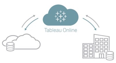
Introduction to Tableau Tableau has always had a clear objective: simplifying data without compromising its power. Picture navigating through data as if embarking on a treasure hunt; Tableau facilitates this exploration, inviting you to dive deep and unleash your creativity. Data Transformed: From Mundane to Magnificent Gone are the days when data was just a boring compilation of figures. Tableau revolutionized this perspective. It empowers analysts to transform these figures into striking visualizations, letting data tell captivating tales through vibrant dashboards and insights. All Data Holds Value Every dataset is a piece of a larger puzzle. With Tableau, whether your data resides in a high-tech cloud platform or a conventional database, all data is important with equal accessibility and evaluation. In 2023, we’ve further enhanced our compatibility, supporting industry leaders like DataBricks, Amazon Redshift, Google BigQuery, SAP, Snowflake, Microsoft Azure, and Starburst. Plus, stay tuned for our upcoming integration with Amazon S3. Tableau Online: Data Analytics Without Boundaries Tableau Online is the embodiment of convenience and flexibility. Available anytime and anywhere, it offers the full Tableau experience from the cloud. With no setup hassles or geographic boundaries, teams worldwide can collaborate and share insights seamlessly. As a cloud-based SaaS, Tableau Online stands out as a top-tier platform for data visualization and analytics, promoting user-friendly advanced capabilities throughout organizations. Tableau On-Premises: Tailored Data Solutions For enterprises that prefer to keep their data in-house, Tableau On-Premises remains a steadfast option. It’s perfectly suited for businesses that prioritize internal data security and want direct control over their datasets. This version of Tableau allows for complete management of the hosting environment, offering enhanced integration, data security, and customization controls. While it grants autonomy over platform maintenance, it also necessitates expertise in handling and updating the system. Distinguishing Tableau Online from Tableau On-Premises in 2023: Deployment & Infrastructure: Tableau Online, a SaaS service, is fully hosted and maintained by Tableau, while Tableau On-Premises needs internal infrastructure. Maintenance & Support: Tableau manages and updates Tableau Online, whereas Tableau On-Premises requires in-house IT expertise. Cost Structure: Tableau Online’s licensing model incorporates a slightly higher per-user cost due to hosting. In contrast, Tableau On-Premises requires a more substantial initial investment for infrastructure. Comparison of Tableau Online and Tableau On-Premises in 2023: To decide between Tableau Online and Tableau On-Premises, consider your unique business needs and requirements. Who will need access? Where will they need to access from? How much control do you need? If you still have questions, you may want to trial both versions to help determine which is the best tool for your operations. [/fusion_text][fusion_text animation_direction=”left” animation_speed=”0.3″ animation_delay=”0″ hide_on_mobile=”small-visibility,medium-visibility,large-visibility” sticky_display=”normal,sticky”] Curious to know more? Schedule a consultation with Thinklytics to know more about how data analytics can make your life easier and make you a hero at work.
Tableau vs. PowerBI in 2023: Which Should Your Organization Use?
In today’s rapidly evolving business environment, the choice between Business Intelligence (BI) systems like Tableau and PowerBI depends on several factors including industry specifics, managerial expertise, user demands, and the audience who will use the data. The key to deploying the best system for you is finding a BI tool that seamlessly aligns with your organization’s unique challenges and objectives. For a business to be truly customer-centric, the ability to act quickly on data insights and offer personalized experiences is crucial. As well, companies are continually expected to do more with less, so executives who rely on accurate KPIs and data-driven insights are better able to steer the ship and outperform competitors. Yet, translating data into actionable insight is a common hurdle. Traditional methods of data replication are often cumbersome and time-consuming, which makes informed decision-making and implementation slow and inefficient. This is where business intelligence platforms like Power BI and Tableau come into play. Both are designed to simplify the complex data landscape, offering intuitive data visualization that transforms raw numbers into tangible, profit-driving actions. Tableau’s Strengths: Real-time Data Handling: Tableau shines with its ability to manage vast datasets in real time, promoting swift analytics and unhindered data exploration. User-Friendly: With prebuilt industry dashboards, Tableau serves users across all sectors, regardless of their analytics proficiency. Versatile Data Integration: Tableau stands out in its ability to pull data from numerous sources, including Google Analytics, Cloudera, Salesforce, AWS, Dropbox, SQL Server, Oracle, Teradata, and more. Sharing & Collaboration: Whether on the cloud, on-premise, or hybrid, tools like Tableau Online and Tableau Server ensure analysts can share insights across devices and platforms. Top-tier Security: Tableau boasts enterprise-level security credentials, ensuring data integrity and safety. PowerBI’s Advantages: Data Editing While Loading: Power BI offers a unique feature that allows data editing during the loading phase. User Assistance: Non-analysts might find Power BI easier to navigate, thanks to Cortana’s assistant, enabling users to ask business questions in natural language. Efficient Data Sharing: Through integration with Microsoft cloud solutions like Office 365, sharing insights is a breeze, whether with just one person or an entire team. Broad Data Source Compatibility: From simple Excel files to Azure databases, collaboration apps, Salesforce, MailChimp, Facebook, pdf, xml and others, Power BI integrates seamlessly. Robust Security: Power BI users can collaborate confidently, knowing that the platform maintains stringent data protection standards. Who Should Use Which? Academics & Libraries: Tableau is particularly beneficial for those in academic sectors needing to blend large data volumes. Researchers can instantly share information and collaborate with a wider audience using data visualization and dashboards, which leads to quick feedback and better results. Librarians can effectively present survey results with compelling visuals and readily share via their website and other channels. Healthcare: Both Tableau and Power BI can drive analytics in healthcare, supporting better treatment planning and improved service quality. Both tools are HIPPA compliant, accelerate operational efficiencies and deliver faster analytics for treatment planning and clinical research. Business Management: Businesses will find value in using any BI system to gain additional insights and empower quicker decision making for increased productivity and profitability. While Tableau excels in handling vast real-time data and connecting separate data warehouses, startups and small businesses might find Power BI’s cost-effective licensing appealing. Education: Students and educators can leverage Tableau’s user-friendly interface to develop assignments and hone analytics skills. They will also find value in the vast capabilities of Tableau to analyze, visualize, and share amongst their communities, both locally and globally. Both groups may take advantage of the Tableau eLearning suite (web based training) with access to a free one-year trial license through their accredited institution. Microsoft-Centric Organizations: Companies deeply integrated into the Microsoft ecosystem will find Power BI’s seamless compatibility with Azure, Teams, and SharePoint incredibly valuable. With Microsoft 365, these dashboards can be connected with Excel queries, reports and other data models. Team members will be familiar with the functionalities and will easily share information across the organization. In Conclusion While both Tableau and Power BI stand out in today’s BI software market, each of them has preferred use cases. Both platforms enhance teamwork and ensure secure, trustworthy environments for data, simplifying the entire data management process, from connection to actionable insights. Tableau offers simplicity and scalability. Users can craft detailed visualizations using accessible statistical tools and machine learning capabilities. PowerBI is generally more cost effective and a simpler choice for smaller datasets and analytic requirements. Ultimately, the choice between Tableau and Power BI boils down to an organization’s unique needs and preferences. Regardless of the choice, both tools are equipped to extract valuable insights from your data and enhance sharing and collaboration which helps ensure your relevance and competitiveness in the years to come. [/fusion_text][fusion_text animation_direction=”left” animation_speed=”0.3″ animation_delay=”0″ hide_on_mobile=”small-visibility,medium-visibility,large-visibility” sticky_display=”normal,sticky”] Curious to know more? Schedule a consultation with Thinklytics to know more about how data analytics can make your life easier and make you a hero at work.
Understanding the Cost Differences: Tableau vs. PowerBI in 2023

In today’s data-driven digital world, data visualization tools are invaluable for parsing vast amounts of corporate data. Teams and leadership depend on such technologies to glean actionable insights. By 2031, the Data Visualization Tools Market anticipates the industry to grow to a massive $20bn. In the constantly evolving business landscape, Business Intelligence (BI) tools are crucial. They streamline organizational performance by showcasing customer-focused data which allows decision-makers to strategize effectively. Two of the frontrunners in this space are Tableau and Power BI. Both tools translate ‘big data’ into visually appealing, easily digestible formats, empowering businesses to make data-backed decisions. While both tools offer free versions, there are key distinctions in their pricing structures. Power BI often emerges as the go-to choice for small to medium-sized businesses, primarily due to its affordability. In contrast, Tableau, with its heftier price tag, is more fitting for larger enterprises. The acquisition of Tableau by Salesforce in a deal worth about $15 billion has only heated up the competition in the BI space. Diving Deeper into Pricing: Tableau’s Offerings Tableau’s pricing is on the steeper side, but it promises comprehensive features for better analysis. It generally performs better with larger data systems. Tableau offers an array of packages tailored to different needs: Tableau Creator at $75/user/month (billed annually), includes Tableau Prep Builder, Tableau Desktop, and one Creator license for Tableau Cloud or Tableau Server. This package will help you connect your data, build ‘vizzes’ and publish dashboards. Tableau Explorer at $42/user/month (billed annually) includes one Explorer license of Tableau Cloud and allows teams and organizations to edit and collaborate on existing dashboards. Tableau Viewer at $15/user/month (billed annually) includes one Viewer license of Tableau Cloud and allows teams to view data and interact with dashboards. Customize your package by choosing the number of Explorers, Creators, and Viewers, coupled with hosting options. Tableau Public is entirely free for home-based analysts. It allows public sharing and online viewing of workspaces. Tableau Student & Academic Programs offers students from accredited institutions a free license and offers discounts to academic institutions. Another Option: Power BI Licenses Power BI also offers a variety of packages with different levels of capabilities, and the best uses of Power BI are usually less complex data sets that may not require real-time analysis. Power BI in Microsoft Fabric – the free version that allows users to create interactive reports. $10/user/month and it allows users to publish and share reports. Power BI Pro is included in Microsoft 365 E5. Power BI Premium at $20/user/month includes all the features of Power BI Pro and allows user access to more advanced data flows, larger models, and a faster refresh rate. Power BI Premium per capacity (with Microsoft Fabric) at $4,995 per capacity/month licenses your organization for extensive storage, analytics, and reporting. Students or individuals can tap into Power BI via school or work email, using My Workspace with a free license. For sharing capabilities, an upgrade to Power BI Premium Per User (PPU) or Power BI Pro are necessary. Tableau vs. Power BI: At a Glance Arlington is the home of the Texas Rangers’ Globe Life Park. It is among the world’s largest baseball stadiums with a capacity of 49,115. Making sure the place is full for every home game is a challenge unique to Major League Baseball (MLB). In the NFL, there are just eight home games in a regular season. The NBA has 41 regular-season home games, but stadium capacity is usually in the 20,000-25,000 range. The Rangers have to try and sell out 81 home games a season! The franchise began using Tableau to track real-time ticket purchases. It also uses the software to track sales or merchandise and food & beverages. The Rangers have seen a steady decline in attendance since a peak season total of 3.46 million in 2012 as you will see in this table: Features Tableau Power BI Types of Licenses Creator, Explorer, Viewer Free, Pro, Premium, Premium per capacity Licensing Models Annual Billing Monthly Billing Fees for Teams $75/user/ month $42/user/month $15/user/month free; $10/user/ month $20/user/ month $4995/capacity/ month Student/Faculty Programs Free for Students discounted for Academic Institutions Same as above All prices and details are subject to change and should be verified with respective vendors. In conclusion, while both Tableau and Power BI offer robust capabilities for data visualization, their pricing models cater to different business sizes and needs. It’s crucial for decision-makers to assess their requirements and budget before choosing the best option for your business. Curious to know more? Schedule a consultation with Thinklytics to know more about how data analytics can make your life easier and make you a hero at work.
Data Powerplay: Maximizing Sports Revenue with Tableau

Much is made of how sports franchises use data to find the right players for their teams. Billy Beane famously utilized ‘Moneyball’ to transform the Oakland Athletics baseball team from also-rans to contenders. The A’s didn’t win the World Series under Beane’s stewardship, but they consistently outperformed their budget. The Moneyball model is now followed by a huge array of sports teams across various sports. The use of data in this manner is so famous now that virtually every fan is aware of it. This is NOT the case concerning the use of data to generate revenue. Yet it makes complete sense. Franchises need a significant degree of revenue to complete at a high level. A growing number of sports organizations are using Tableau to streamline operations, engage fans, and generate revenue. In this piece, we look into the use of Tableau for this purpose. This includes a case study into how the Texas Rangers baseball team has utilized the data visualization software. Table of Contents How Professional Sports Franchises Make Money Case Study – The Texas Rangers Here’s How Sports Teams Can Use Tableau to Drive Sales Conclusion How Professional Sports Franchises Make Money The National Football League is by far the most successful sports league in American history. Today, it is a trade association comprised of 32 members. These franchises are individually owned, barring the Green Bay Packers, who remain a publicly owned, non-profit corporation. The NFL’s private status makes it challenging to calculate its actual earnings. However, best estimates (from Bloomberg) suggest it earned $15 billion in 2018. This is an increase on its apparent $13.3 billion revenue in 2016. The NFL’s business model divides revenue streams into ‘National’ and ‘Local’ revenue. In 2018, the NFL earned $8.1 billion in national revenue. Therefore, each franchise received $255 million in national revenue from the league. Local revenue, on the other hand, differs according to each team. The Green Bay Packers, for example, earned $196 million in this manner. It equated to 43% of its overall earnings for the year. Now, consider the fact that Green Bay had an operating income of just $38.5 million. This is because the organization spent $420 million on stadium upkeep, wages, marketing, and team and administrative costs. In contrast, the Dallas Cowboys, the richest team in the NFL, had an operating income of $365 million! Here are the different revenue-generating vehicles for NFL teams: TV Deals: These comprise around half of a team’s income. Merchandising & Licensing: This makes up approximately 10% of a team’s income. Ticket Sales & Concessions: Accounts for perhaps 7% of revenue. Corporate Sponsors: Varies according to the team. Gambling: In May 2018, the Supreme Court ruled that individual states can decide whether to allow sports betting. The NFL will surely jump on gambling as a form of revenue. For teams looking to squeeze out every last dollar, using Tableau to help with merchandising, ticket sales, marketing, and concessions, makes sense. The Texas Rangers are a prime example of how to do it right. Case Study – The Texas Rangers in Major League Baseball Arlington is the home of the Texas Rangers’ Globe Life Park. It is among the world’s largest baseball stadiums with a capacity of 49,115. Making sure the place is full for every home game is a challenge unique to Major League Baseball (MLB). In the NFL, there are just eight home games in a regular season. The NBA has 41 regular-season home games, but stadium capacity is usually in the 20,000-25,000 range. The Rangers have to try and sell out 81 home games a season! The franchise began using Tableau to track real-time ticket purchases. It also uses the software to track sales or merchandise and food & beverages. The Rangers have seen a steady decline in attendance since a peak season total of 3.46 million in 2012 as you will see in this table: Four Ways the Texas Rangers Used Tableau to Boost Sales & Revenue Real-Time Ticket Sales Data: The Rangers’ staff used Tableau to bring several data sources together into a single view. The front-office team created a dedicated ‘Analytics Task Force.’ The team ensured that employees in different departments were able to access data and share dashboards. Ticket Specials: The Texas Rangers launched a special four days before a Father’s Day game and could track the real-time performance. The franchise also used Tableau to discover that approximately half of the individual ticket sales occur in the 10 days before the game, including on the day of the event. Staffing: The staff of the Rangers used Tableau to understand how rain delays affected sales. The team discovered that there wasn’t a single ticket sale for 15 minutes after rain delayed a game. As a result, the Rangers decided to shut down three-quarters of its box-office windows. Promotions: The team believed that the highest sales for ‘bobblehead’ nights occurred on Friday, Saturday, or Sunday. They were shocked to learn that Tuesday was the best seller! The Rangers added an extra bobblehead night on a Tuesday night game at the end of a month. The result was an increase in ticket sales. Here’s How Sports Teams Can Use Tableau to Drive Sales The efforts of the Texas Rangers is just one example of how sports franchises use Tableau. Here is a simple overview of what they can use Tableau to do. Visualization of Ticket Sale Trends: With Tableau, it is possible to visualize the data and quickly see relevant trends. Through this process, you can make rapid changes and increase revenue. Without access to this real-time data, you’ll have to wait until the end of the season and lose precious income. Understand What Your Fans Want: Yes, they want their team to win, but they also want to have an enjoyable experience. With Tableau, you can easily analyze data such as finding out how many people leave before the end or the promotions that work best. Increase Concessions Stand Revenue: Part of
5 Best Online Courses for Learning Tableau

We offer a wide range of services to help you get the most out of Tableau. However, at Thinklytics, we also believe in educating potential clients. For us, there is no better business intelligence tool on the market than Tableau. The following corporations use it: Amazon Deloitte LinkedIn Walmart Tableau is especially heralded in the following industries: Healthcare Management consulting IT Financial services However, even though it is marketed as easy to use, there is still a learning curve. If you are an experienced data analyst, you will have little difficulty using Tableau and figure out how to get the best out of the remarkable data visualization tool. However, inexperienced users could find it overwhelming, primarily due to its enormous range of features. As such, it makes sense to find an online course that can help you make sense of Tableau. Fortunately, there are a huge array of options. Unfortunately, not all of them are created equal. Some are extremely expensive and don’t offer value for money, while others are a rip-off. This is why we have created a list of five excellent online courses for Tableau. Tableau: Tableau Training Who else is better than the creators of the platform? The official Tableau website has a remarkable level of information and is laden with tricks, tips, and resources. No matter what the problem is, you will ultimately find the solution if you look hard enough. There are endless live training options where you can choose a topic for a one-hour webinar. Audience participation is welcomed with a Q&A session at every training session. There are also virtual training courses and eLearning options where you can explore Tableau at your own pace. There are also hundreds of videos with information ranging from showing you the basics to dashboards and analytics. While a lot of the knowledge is free to use, the eLearning courses charge a fee. Data Visualization with Tableau Specialization: Coursera This is one of the highest-rated Tableau training courses you’ll find. Over 61,000 people have enrolled at the time of writing, and it is free to use. The course offered by UC Davis has a rating of 4.6 stars from over 8,600 reviews. It promises to help you: Discover and learn the different Tableau features available. Analyze the quality of the data you find, and engage in an exploratory analysis. Design visualizations and dashboards for your target audience. Combine the data you use to present the story you want to tell. Overall, there are five course options: Data Visualization with Tableau Project Creating Dashboards and Storytelling with Tableau Visual Analytics with Tableau Essential Design Principles for Tableau Fundamentals of Visualization with Tableau When you complete a course, you receive a certification you can share with prospective employers. Although you can view the information for free, you need to join a membership program to earn the certification. The membership costs around $600 per annum. It is an official program and involves Tableau as an industry partner. The instructors are UC Davis faculty staff, and the institution recommends dedicating three hours a week. If you do that, you should finish the course in around six months. Tableau 2020 A-Z: Hands-On Tableau Training for Data Science: Udemy Kiril Eremenko created this tutorial, and he is known as an experienced instructor, having taught over half a million students online to date. Presumably, the course’s name will change to Tableau 2021 soon! At present, it has a rating of 4.6 from over 58,000 reviews! In general, Udemy courses have a reputation for being extremely expensive, but well worth the price. Initially, this course cost $199.99, but Udemy reduced it to $149.99. The brand often has flash sales where they knock 90% off the price for a short period. This course specializes in Tableau Desktop and is designed for complete beginners. It will help you: Create bar charts, pie charts, maps, and area charts. Work with parameters. Export results from Tableau into different software like PowerPoint. Add actions to dashboards. Create calculated fields in a blend. All you need to do is install Tableau Desktop and enroll in this course. The instructor will show you everything else. It is only 7.5 hours long, so make sure you pay attention! Data Visualization and Communication with Tableau: Coursera This particular course comes from Duke University. It has a 4.7-star rating from almost 2,800 reviews. Once again, you will need to pay for the membership with Coursera if you want to earn the qualification. However, you have the option to enroll for free and read the content. It is course #3 in the 5-part Excel to MySQL: Analytic Techniques for Business Specialization series. It is a four-week program that teaches you the following: Asking the right questions to succeed in data analysis projects. Visualizing data with Tableau. Dynamic data manipulation and presentation with Tableau. Getting the most out of your communication toolbox. You can change deadlines according to your schedule, and the entire course should take around 25 hours to finish. Tableau Essential Training: Lynda If you are a complete novice and have no idea where to begin with Tableau, this basic training course is ideal. It is designed for beginners and is a gentle introduction to the use of the business intelligence tool. The entire course is 4.5 hours long and includes the following topics: Using groups and sets in Tableau to combine data. Using various chart types to create basic visualizations. Explaining the platform’s data source configuration and management. Providing examples of data analysis in Tableau. Applying mapping techniques. At the end of this course, you will have a reasonable grasp of how to use Tableau. You can then proceed with a more advanced course. Final Thoughts on the Best Online Courses for Tableau These days, having a high level of Tableau knowledge can lead to a lucrative career. For example, a qualified Tableau developer can command a salary of over $100,000 per annum. If you run a business, Tableau can help you make sense
Tableau Prep Builder – How Can It Help Your Business?

According to the Pareto Principle, approximately 80% of the consequences come from around 20% of the causes. In the modern era, we call it the 80/20 rule. It essentially says that we should find a way to become more efficient. The 80/20 rule isn’t some trite click-bait statement either. We can see it in various facets of business: 20% of a business’ customers account for up to 80% of the total profit. 20% of sales representatives generate around 80% of sales. 20% of patients account for 80% of healthcare spending. Why is it then, that data analysts do things the other way around? A 2017 Harvard Business Review found that analysts spend up to 80% of their time preparing data, and only 20% on actually analyzing it! Imagine if there was a tool capable of helping you build your flow and speed up the analysis part of the job. Guess what? There is, and it is called Tableau Prep Builder. Here’s What Tableau Prep Builder Can Do for You If you’re stuck for time and can’t read the whole article right now, here’s a quick overview of what Tableau Prep Builder can do. We also outline the pros and cons. You can always come back later. Quickly and easily transform and shape your data for analysis. See all your data at a glance thanks to Prep Builder’s clean interface, which is highly visual and easy to understand. Easily connect to whatever data matters most to you, whether on-premises databases, in the cloud, or on a spreadsheet. Visually combine and rapidly reshape & clean your data from various sources. Provides drag and drop functionality that instantly joins data together. See the outcome of data joins and spot exclusions. Express data in different ways through the use of calculations. Locate inconsistencies and outliers in your data, fix them in moments. Tableau Prep Builder Pros Enables users to find and fix problems in data without having to write code. Integrated with Tableau, so subscribers can put their data to use as soon as they wish. Allows users to share data with the relevant parties securely. Data flow scheduling. Extremely easy to use, especially for those with Tableau Desktop experience. Excellent level of support from the Tableau team. Free trial. Tableau Prep Builder Cons Some users suggest it is sluggish when making a substantial number of changes. Not the best option if you need to query your database for a data set for review and prepare for analysis. What is Tableau Prep Builder? It is a fantastic tool to help you clean and organize your data. The purpose of Tableau Prep Builder is to make it easier to tidy up the information you bring in from different sources. Its visual interface offers a detailed look at your data, and its list of excellent features ensure that users find the data preparation process easier than ever. It is an ETL tool, which is similar to the likes of KNIME or EasyMorph, but more advanced. Once you perform the cleaning up process, you use Tableau Prep Builder output as the Desktop data source for analysis. Like Desktop, Prep Builder is pretty easy to learn with Tableau’s superb drag-and-drop interfaces making things simple, even for novices. It is comprised of two products: Prep Builder: This lets you combine and clean the data for analysis. Prep Conductor: This allows you to share data flows and manage them at scale. It is in the Tableau Data Management Add-On. Let’s dig a little deeper and see what Tableau Prep Builder is like to use. User Interface If you are a Tableau Desktop user, you will love Prep Builder’s UI. It resembles Desktop with a clean and clear interface that is extremely easy to use. From an Official Tableau Video When you click on any element, you receive another set of profile panes with further tailored data. These secondary windows are crisp and clear, with an array of fields and sample values. The mini bar charts and data review elements in the profile pane are among the best features offered by Tableau Prep Builder. Rather than trying to decipher information amongst a list of confusing data, you can see crucial values and spot-check your data rapidly. Data Connection Imagine a situation where you have to analyze sales and profit figures for the last few years. After the laborious task of data gathering, you notice, to your horror, that the data was collected and tracked differently for various regions. Further checks reveal incorrect data entry, and the entire thing looks like a mess that will take hours to clean. With Tableau Prep Builder, the above scenario no longer means hours slumped at a desk. Click on the ‘Connections’ tab, which you can see on the top-left of the image above. You can start building a flow and have several options to connect to data. The official Tableau website has the above scenario on one of its ‘Help’ pages. It outlines how you can do the following with data: Connect Explore Clean Combine Run your flow and generate output It looks long and complicated when written out, but once you get used to Tableau Prep Builder, you’ll go through the process in a fraction of the time you think. Data Extraction Made Simple Once you are satisfied with your data and flow, creating an extract from the newly cleaned and organized data is simple. Again, check out the clean interface. Interworks.com Tableau Prep Builder is busily trying to match what’s available on Desktop as far as connectors go. There is no question that Tableau will continue to upgrade as the brand always does. On that note, let’s see the latest updates of Tableau Prep Builder. Tableau Prep Builder – What’s New? Since the 2019.1.2 version, Tableau Prep became Tableau Prep Builder. The latest version is 2020.3.3. Here is a quick overview of what’s been added. Recovered Flows: As is the case with Desktop, Prep Builder saves your flow if there is a crash.
Tableau Acquires ClearGraph: Database Talk! – Forbes

Simpler to use than database query language (and easier to look at too). Adrian Bridgwater , CONTRIBUTOR Data visualization company Tableau Software has acquired ClearGraph, a Palo Alto startup that produces what it calls ‘data discovery’ and analysis technology that works through spoken ‘natural language’ queries. There’s an almost mirror-like balance to what is going on here, so what do these two firms actually make? Data: easier out, easier in? Tableau’s technology allows users to graphically visualize data held inside databases. That means users don’t just have to look at columns and rows, they can more easily see trends in data when it is represented by heat maps, pie charts, scatter plots, gantts, and bubble charts. Equally, for users that aren’t skilled in how to run database queries, ClearGraph’s technology allows users to query data using the spoken word. With Tableau now integrating ClearGraph into its own IT stack, this is a kind of easier out (using interactive visualizations) and easier in (using simple voice commands) approach to how to work with database information. “We founded ClearGraph because we saw a need to bridge the gap between humans and computers through natural language, especially when it comes to exploring data,” said Andrew Vigneault, CEO of ClearGraph. “Tableau is a natural fit for us because we have similar missions, cultures and a genuine desire to help more people around the world access, interact with and get answers from their data.” The most recent updates from Tableau saw the firm upping the machine learning abilities of its data visualization tools i.e. if a user (perhaps one without a statistically-gifted brain) isn’t sure what kinds of trends they should be looking for in the data graphics they are looking at, then the system itself will start suggesting metrics that could be worth tracking. For the firm to buy ClearGraph and put natural language queries into its total offering, this almost flows in a similar vein i.e. it’s another extension to make big data analytics accessible to people outside the database engineering department itself. But what is (arguably) most interesting of all is the way this technology will deliver computational linguistics inside the context of semantic inference-based natural language interfaces. That sounds complex, but it’s not… it’s all about how well we humans present our spoken queries to computers. Humans speak with ‘too much meaning’ If we ask a computer system the price of BMWs for sale in the state of Maryland, it’s logical reply will include ALL possible answers. We might more logically want to know the price of cars that are either used or new. We might want to filter out cars that are more than two hours journey away. We might also want to set a certain price bracket. How about color? What about interiors? The problem is that there is ‘too much meaning’ in our original query. So the only way of asking for this query accurately would be to say: ‘give me the details of BMWs in Maryland within a radius of 100 miles under $20,000 excluding any with yellow paint jobs’… and even then we haven’t managed to specify leather interiors. This is where the most recent advances in natural language computing also have an appreciation for human ‘intent’ so that queries can be automatically narrowed and refined before they are delivered. Accessing and analyzing data using ClearGraph requires no technical training, as the system can infer users’ intent. For example, people could ask questions such as, “Total sales by customers who purchased staples in New York,” then filter to, “orders in the last 30 days,” then group by, “project owner’s department” for example. Tableau is saying that ClearGraph brings a consumer-like experience to users by connecting disparate data sources and making them accessible and intelligible through simple conversational style search. ClearGraph’s natural language query technology stores semantic data in knowledge graphs that can expand and learn over time. “We are thrilled to bring the ClearGraph team to Tableau to enable people to ask questions of their data using natural language,” said Francois Ajenstat, chief product officer at Tableau. “Natural language queries will make it easier for more people to interact with Tableau, whether you’re an executive who needs an answer quickly, or on a mobile phone and want an answer from your data on the move. We’re excited about this acquisition as the ClearGraph team shares our mission and is aligned with our innovation perspectives on conversational analytics.” Will Tableau worry Microsoft or Oracle? Will Tableau win over fans of Microsoft Power BI and leave Redmond fuming with this the (only) third acquisition in its company history? Could firms who are not sold into the Microsoft Azure cloud computing stack see this as a way of getting easier access to database query and analysis tools to use across a wider transept of computing platforms? Yes, a bit, somewhat, but not enough to a cause too many ructions in Redmond or indeed inside the hallowed halls of Oracle’s inner sanctum. Instead, we might reasonably argue that this logical enough acquisition will strengthen and diversify Tableau’s own customer base who will now get some extra smart tools and help more users to start getting exposed to data analytics. It’s a big (smart) Business Intelligence pie and there’s enough for several cooks to stir this cauldron. [/fusion_text][fusion_text animation_direction=”left” animation_speed=”0.3″ animation_delay=”0″ hide_on_mobile=”small-visibility,medium-visibility,large-visibility” sticky_display=”normal,sticky”] Curious to know more? Schedule a consultation with Thinklytics to know more about how data analytics can make your life easier and make you a hero at work.
5 Expert Data Visualization Tips for SME Tools

NAZIRAH GARRISON MAY 10, 2016 Let’s talk about data—specifically visualizing your data in a way that unveils insight faster. You already know that using visualizations to communicate data is fast, easy, and efficient (pictures are so much easier to interpret than a crosstab full of numbers!). But you might be wondering how to communicate with your data even faster. Here are five tips to let your data speak for itself. 1. Less is more. Keep it simple! Strip off extraneous “non-data” ink (i.e. anything that doesn’t help you understand the data), and keep your chart types simple and easy to interpret. Ask yourself (or even your colleagues): Does this help people understand the data? Let’s look at Girl Scout cookies (because who doesn’t love Girl Scout cookies!) and see what our most popular varieties are: image: https://cdnl.tblsft.com/sites/default/files/blog/newnaz1.png We can see from the table (after a bit of reading) what our two most popular cookies are: Samoas and Thin Mints. But ranking the rest of them takes a little more brain power. The human brain can deal with about seven bits of information before it starts to drop things. And we’re going to push our limit if we just stick to the table. Let’s visualize the information. image: https://cdnl.tblsft.com/sites/default/files/blog/naz2.png Now I have my cookies represented by different colors in a bar chart. Except which one’s Rah-Rah Raisins and which one’s Trefoils? The Samoas and Thin Mints kind of look reasonably similar in terms of numbers, and the Samoas look closer to 70 than 60. I think we can tidy this up a bit and remove the 3D effects. And we only need one color if we use labels: image: https://cdnl.tblsft.com/sites/default/files/blog/naz3.png There! Much better. We removed all the stuff we didn’t need. And now, instead of being overloaded with all the information presented, your brain can quickly and easily understand what’s going on. We used the brain’s ability to process certain things (like position and length) and removed things that confuse our brains (like 3D images on a flat plane) to help us understand our data much more quickly. 2. Pretty doesn’t mean effective To misquote Lorelei Lee: “Pretty doesn’t mean effective, but my goodness, doesn’t it help?” There’s a misconception that an effective data visualization must be aesthetically pleasing to be effective. Not true! Sure, “pretty,” as in so many cases, can help, but make the focus “aesthetically pleasing to the eye,” and you risk drawing your viewer’s eye away from the most important thing in your visualization—the data. Take a look at the chart below. It shows the Seattle-area housing market, more specifically which counties the for-sale homes are located. How easy is it to compare counties? Where are the most houses are listed? Where would I have the hardest time buying a house? Where is your eye drawn preferentially? Is that where it should be drawn? Are you missing important information? But this is something that is also audience-dependent. Sometimes you want something pretty and eye-catching so that people are drawn to what you’re saying. But when that comes at the expense of being able to communicate what your data shows, you’ll lose someone’s interest just as quickly as you gained it. 3. Use color judiciously I could write an entire post on color usage, but I’ll sum it up in three tips. Color for Numerical Scales? Use with Caution. This can get confusing. The way you interpret a shade depends on other colors around it. Take a look at this map. If I ask you whether Idaho is doing better than Nevada, what would you say? Instinctively, you’d say Nevada’s doing the same, but the reality is that Nevada is doing better than Idaho. Nevada just looks paler because it’s next to California, which is doing really well. image: https://cdnl.tblsft.com/sites/default/files/blog/map_color.png We might be tempted to make a map with our data just because we have geographical fields and maps are so easy to make with Tableau. But, again, ask yourself the question: Does this help answer the question? In the case of a map, they are really useful for looking at clusters, especially if the data contains geographical grouping. Perhaps we have fewer sales in northern states in the winter because it’s too cold, for example. Maps tend not to do so well for simple comparison between states or regions for a number of reasons (we’ll talk about those next). But remember: Color perception, is, as mentioned earlier, a tricky thing. And having light and dark colors next to each other can lead to false conclusions. Choosing the right chart type for the question you’re asking is critical! The bar chart here answers the question of “which state is doing better?” far more effectively than the map. image: https://cdnl.tblsft.com/sites/default/files/blog/bars2.png Leverage Color Associations Everyone knows that strawberries are red, pears are green, and oranges are, well, orange. Use that! And not just for everyday things. If you have a brand identity that your users strongly associate with, take advantage of that. Color is an instant key that leverages long-term memory as soon as you see it. We could confuse people: image: https://cdnl.tblsft.com/sites/default/files/blog/fruit1.png Or we could make it so that people don’t even need the legend to interpret the figure: image: https://cdnl.tblsft.com/sites/default/files/blog/fruit2.png Use Bright Colors to Highlight Want to attract attention to a certain part of your data? Alarm colors draw the eye quickly to areas that need attention, and help get that message across. Are our sales meeting targets? We can use visual best practices, minimize data ink, and create a bullet chart for easy comparison. We can color-code products that are meeting targets and those that aren’t: image: https://cdnl.tblsft.com/sites/default/files/blog/colorbars1.png The orange certainly captures my attention and tells me where I have problems, but that blue is pretty bright, too (and we’re using Tableau’s default color palette here, which was designed so that any one color doesn’t stand out too much). We want to draw attention to the orange. So let’s try a different approach: image: https://cdnl.tblsft.com/sites/default/files/blog/colorbars2.png Much better. The